Skin + Sanctuary
SITUATION
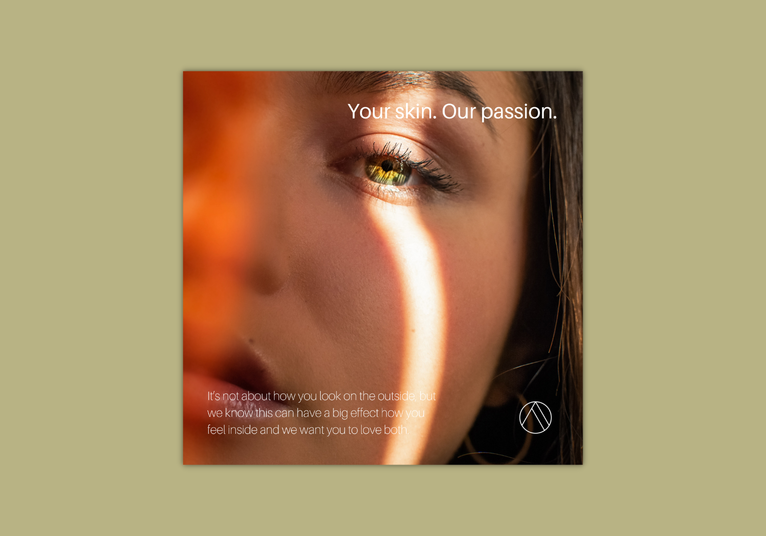
Sisters Sonia and Saira were opening an aesthetics practice in East London, and approached us for naming and branding. Together we developed the name Skin + Sanctuary, to present their specialism in advanced medical skincare solutions, but also give a feel of wellbeing and relaxation.
#1 Moodboard
For the moodboard, we took inspiration from minimal design with a feminine feel, sans serif fonts, monochrome and rose gold hot foil. Shapes with curves and geometric elements also feature.
Logo concepts
Our creative process took us in several directions, we decided that numbers 1, 3 and 4 were strongest and presented these to the client.
The client opted for the concept with an abstract brand mark, which combined glyphs representing the self, connection and transformation within a roundel.


