Right Point
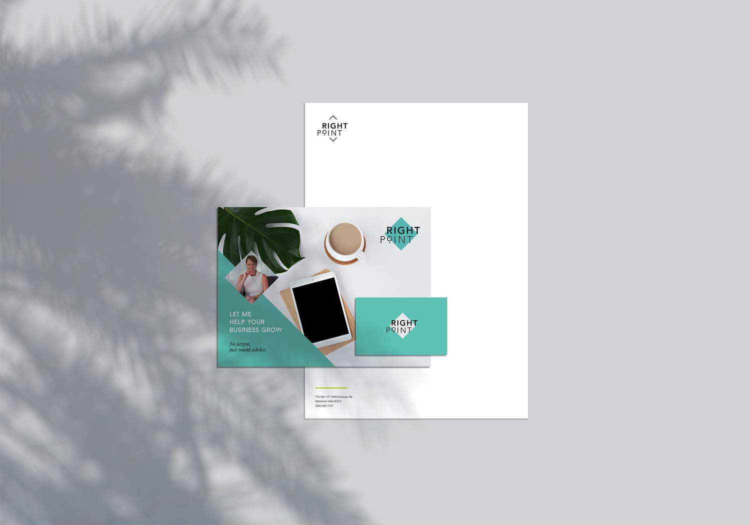
A fresh and feminine brand identity for a business consultant wanting to anchor small businesses in wellbeing.


Situation
Claire Corbett is a business consultant with over 20 years experience of business and a hands-on-approach to helping entrepreneurs launch and grow their businesses. She is a qualified business coach with skills in marketing, business planning and strategy; who has experience of working within startups (during dot com boom) and on her own business (a travel golf company).
She had an existing brand and website when she approached us but acknowledged they were dated, and didn’t truly convey what she was about.
Discovery
We identified that Claire’s target audience was mostly female, and predominantly women who had decided to start a business in order to find a way to work more flexibly around their children, and so we opted for a very elegant feminine look, but with a clean professionalism.
Moodboard
Claire’s previous brand was a teal colour which I felt worked well for her audience, so we simply refined this into a fresher mint and beige, for a chic look.
The logo
The business name refers both that it’s the ‘Right point’ for women to set up the business they’ve had at the back of their mind, and that by working with Claire, she can guide them to the right point with it.
Claire’s original logo was a compass, and we liked this idea but felt it needed to be less literal, so we designed a diamond in a circle, as a simplification of the compass shape. We explored this further and ended up simplifying further to just the diamond shape, knowing that most social media would crop the logo into a circle in any case.
Brand Identity
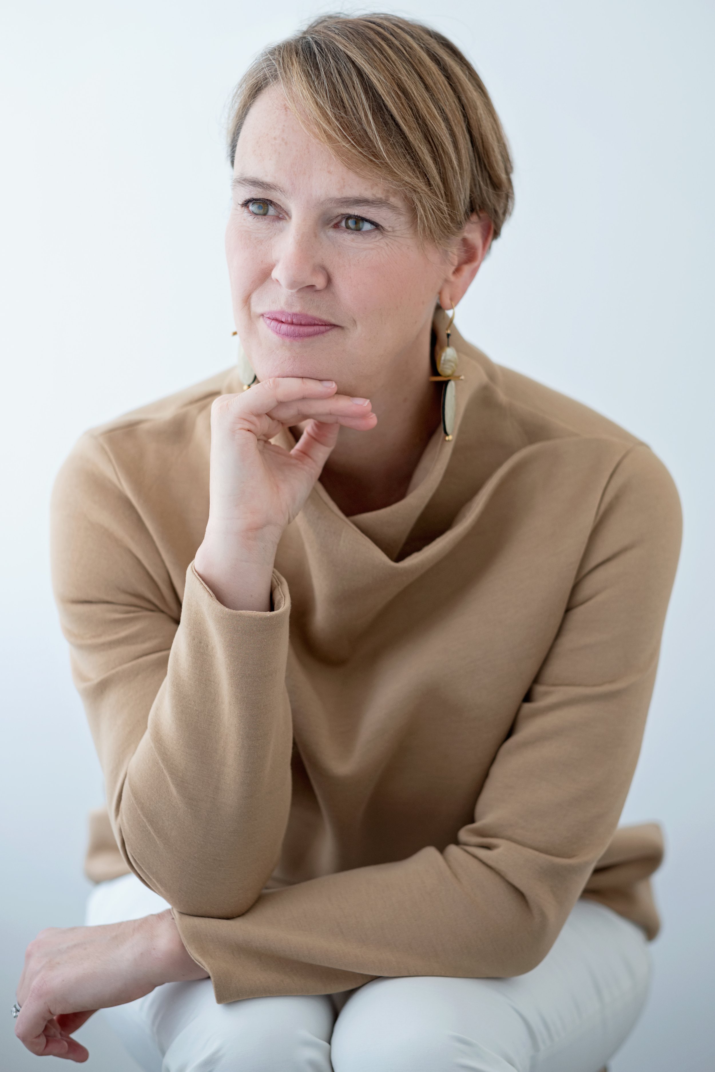
We took inspiration from one of the key phrases from our discovery session ‘helping businesses grow’ as the route for a visual analogy of business growth and plants. We curated a gallery of stock images alongside providing direction to Claire for her photoshoot to ensure harmony between all the tones.


